Posters
Posters
For many years, Marenthe created a poster to showcase her studio's diversity and share her unique sense of humour. Many of these posters quickly became collectors' items and award winners.

“In the poster for Villa Basta, Marenthe Otten scatters casually drawn decorative lettering across a photograph of an elderly woman wearing the traditional clothes of a peasant. The crudely formed letters carry associations of folk art, while also recalling the doodled letterforms found in contemporary work by designers such as Ed Fella in the US and M/M in France. The graphic and photographic layers clash awkwardly, yet the poster still knits together as an image.”
Rick Poynor in Kwintessens
Rick Poynor is a British writer on design, graphic design, typography and visual culture. He began as a general visual arts journalist, working on Blueprint magazine in London. After founding Eye magazine, which he edited from 1990 to 1997, he focused increasingly on visual communication. He is writer-at-large and columnist of Eye, and a contributing editor and columnist of Print (magazine).

Awards: Schoonblaffer
Blaffer in street slang means gun. It also translates as 'a person that barks'. Schoon is beautiful. A gutsy self-initiated award winning project that demonstrates Marenthe's ability to work confidently with fonts | client: Schoon of Schijn
• Published in Area 2 (Phaidon Press 2008)
• Shortlisted Type Directors Club Tokyo
• International poster exhibition Shanghai
• Included in the collection of Stedelijk Museum Amsterdam

Festival Cement, 's-Hertogenbosch. Festival Cement is a major platform for the youngest generation of talented Dutch and Flemish theatre makers, choreographers and writers. Created during Marenthe's time with Studio 't Brandt Weer.

Festival Cement, Maastricht

Love Me.
Made in collaboration with silversmith Chris van Grinsven.
• Selected to appear at the prestigious House of Images exhibition in Brussels, Belgium
• The exhibition 'The Way of Type' began in March 2017 at the Beijing Advertising Museum. The exhibition traveled during the next months to five Chinese cities, including Shanghai. Organized by Zhao Liu (Head of the China Central Academy of Fine Arts) with typographer Jan Middendorp from Berlin as curator.

It's not just the metals that are precious... Marenthe has relished the process of collaborating with Silversmith Chris van Grinsven. Design, concept and text grew simultaneously, each influencing the other.

• Shortlisted Dutch Design Awards
Poster, created during Marenthe's time with Studio 't Brandt Weer in collaboration with Koen Geurts.
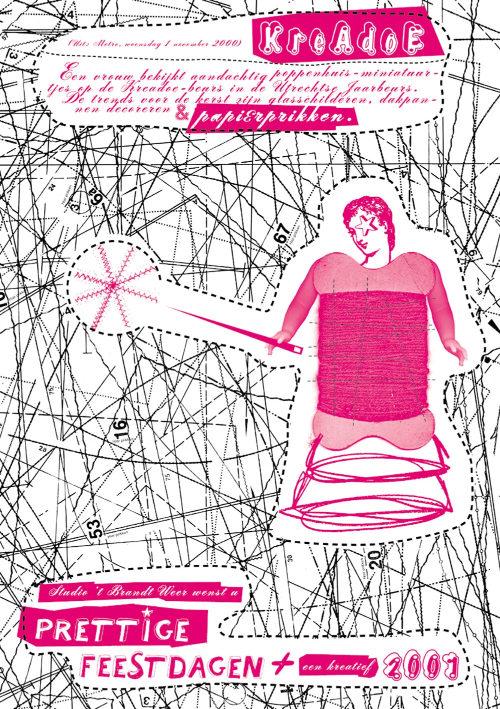
Kreadoe

A seriously ridiculous message conveyed in a seriously amusing way. Every Christmas, Studio 't Brandt Weer (1999-2009) created posters to showcase the studio's diversity and share their unique sense of humour. Created during Marenthe's time with Studio 't Brandt Weer in collaboration with Koen Geurts.
• Short-listed Dutch Design Awards, 2003
• Certificate of Typographic Excellence, Type Directors Club New York

Poster Victorian Circus in collaboration with Koen Geurts, photography: Geertjan Cornelissen | client: De Brakke Grond

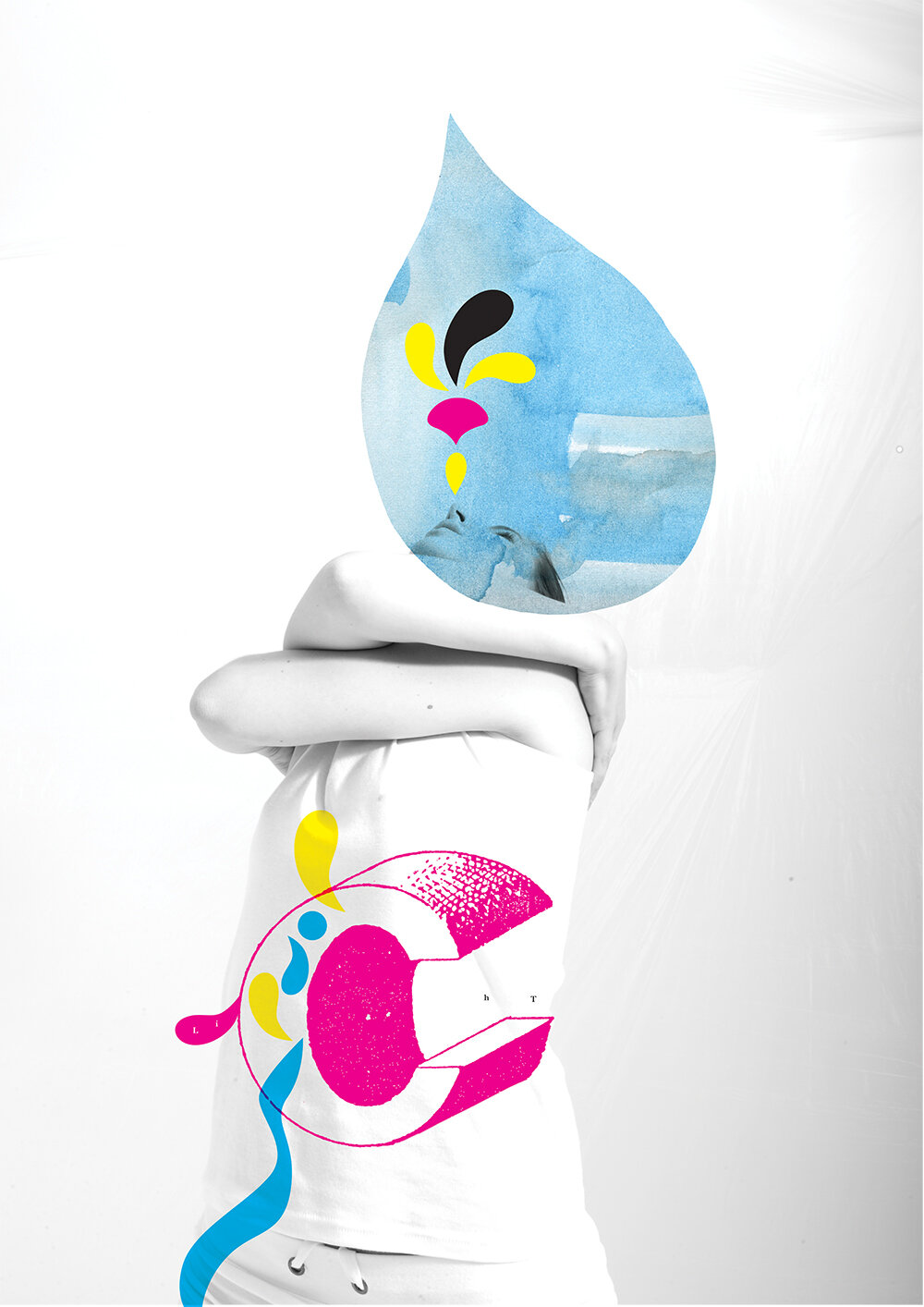
Poster, created during Marenthe's time with Studio 't Brandt Weer in collaboration with Koen Geurts.

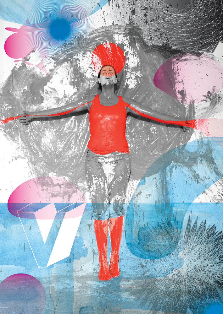
Poster, created during Marenthe's time with Studio 't Brandt Weer in collaboration with Koen Geurts.

Poster, created during Marenthe's time with Studio 't Brandt Weer in collaboration with Koen Geurts

Poster, created during Marenthe's time with Studio 't Brandt Weer in collaboration with Koen Geurts
Netherlands Dance Theatre
Marenthe collaborated with a dancer and a photographer (Geertjan Cornelissen) to create 20 posters to celebrate the 50th anniversary of the world renowed Netherlands Dance Theatre. The posters were exhibited in a public space in The Hague and formed a commemorative book. With special thanks to Johan Nijhoff.
Shortlisted Dutch Design Awards*